
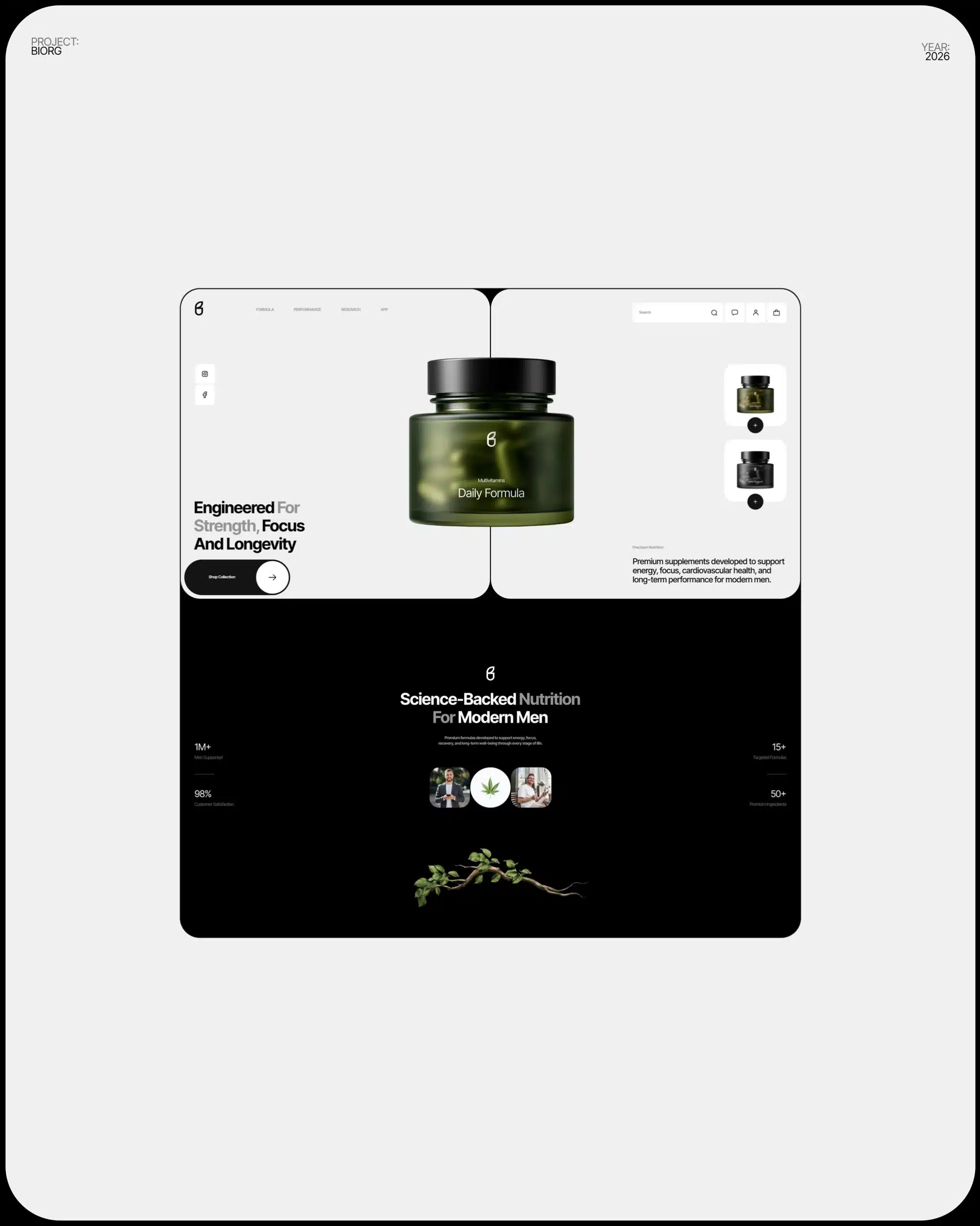
In a real store, a customer can pick up the product. Turn it around. Feel the fabric. Ask you a question. Online, they can’t do any of that. The product page has to do it for you.
That’s why it’s where most online sales are won or lost. Someone arrives, looks for ten seconds and leaves. Usually not because of the price. Because the page didn’t answer a question: what size is it, what’s it made of, how much is shipping, when does it arrive.
And the usual reaction is to add pressure: countdown timers, flashing “only 1 left!” banners, pop-ups with discount wheels. That’s like a salesperson following you around the store. It doesn’t help you decide. It makes you leave faster.
These are the product page tips I use with my clients. No tricks. Just a page that answers questions.
Tip 1: Put the important stuff where the eye goes first
On a computer, the classic layout works for a reason: photos on the left, information on the right.
On the right, in this order:
- Product name.
- Price, big and clear.
- Options (size, color, flavor).
- The “Add to cart” button.
- Shipping and returns in one line.
- Details below.
On a phone, it’s the same order, one thing under the other. If someone has to scroll to find the price, something’s wrong.
Tip 2: Photos that replace touching the product
Photos are your hands. Use four to six per product:
- Front, clean background.
- Side or back.
- A close-up of the material, the texture, the stitching or the frosting.
- In use, so people get the size: the mug in a hand, the shirt on a person, the cake on a table.
Keep the colors real. If the shirt looks red in the photo and arrives orange, that’s a return and a bad review. And compress the photos (WebP) so the page doesn’t take forever. More on that in How to speed up your website.
You don’t need a professional studio to start. A recent phone, a window with daylight and a white sheet of poster board do a lot.
Tip 3: Descriptions people can scan
Nobody reads a poetic paragraph about a T-shirt. They look for facts. Use a short sentence about what it is and who it’s for, then a list:
- Material: 100% cotton, heavyweight.
- Fit: regular, true to size.
- Care: machine wash cold.
- Made in: Utah.
For food: ingredients, size, how many people it serves, how long it lasts. For a service: what’s included, how long it takes.
And write your own descriptions. The supplier’s text is on fifty other sites, and Google knows it.
Tip 4: Options that are easy to choose
- Show sizes and colors as buttons you can tap, not a hidden dropdown.
- If a size is sold out, cross it out. Don’t let people pick it and get an error at checkout.
- Show stock honestly: “In stock,” “Ships in 24 hours,” “Only 2 left” (only if it’s true). No fake countdown timers.
Tip 5: Shipping and returns, right there
Surprise shipping costs at the last step are one of the main reasons people abandon a cart. Don’t hide them.
| Instead of this | Do this |
|---|---|
| Shipping shown only at checkout | “Free shipping over $75. Arrives in 3 to 5 days” under the button |
| A link that says “Policies” | “30-day returns, free return label” in plain words |
| No pickup option | “Free pickup at our shop in Murray” if you have a store |
Tip 6: Make it easy on the phone
Most people will look at your products on their phone, often with one hand.
- A small bar fixed at the bottom with the price and the “Add to cart” button, so it’s always visible.
- Apple Pay, Google Pay or Shop Pay, so nobody has to type a card number on a tiny keyboard.
- Long info (size guide, care, returns) in sections that open and close, so the page doesn’t go on forever.
Tip 7: Reviews from real customers
People trust other customers more than they trust you. That’s normal.
- Show the star rating near the name.
- Mark reviews from verified buyers.
- Let customers add photos. A real photo of your cake at a real birthday party sells more than any description.
- For clothes, a small note helps: “Most customers say it runs true to size.”
No reviews yet? Ask your first ten customers. Most people are happy to help a small business when you ask nicely.
Tip 8: Help Google understand the product
- A clear title: “Tres Leches Cake, 10 inch | Your Bakery”, not “Product 47.”
- Product information in Google’s language (schema): price, availability and rating. In Shopify and WooCommerce with a good SEO plugin, most of this is automatic.
- One page per product, even if it comes in five colors.
I explain the rest in SEO for online stores.
Product page tips: quick checklist
| Check | OK? | |
|---|---|---|
| 1 | Name and price visible without scrolling | [ ] |
| 2 | 4 to 6 real photos, light files | [ ] |
| 3 | Details in a list: material, size, care | [ ] |
| 4 | Options as buttons, sold out crossed out | [ ] |
| 5 | Shipping and returns under the button | [ ] |
| 6 | Fixed buy button on the phone | [ ] |
| 7 | Apple Pay or Google Pay | [ ] |
| 8 | Real reviews | [ ] |
What I’d do if I were you
Pick your best-selling product and fix that page first: better photos, the list of details and shipping info under the button. Then copy that format to the rest. One good page, repeated, is better than fifty average ones.
If you’re just starting to sell online, read How to sell online as a small business. And if you want a store set up with all of this from day one, my Online Store plan includes your first 20 products loaded. Or ask me.
Frequently asked questions
What should a product page include?
A clear name and price, four to six good photos, a short description with a list of details, simple options, shipping and returns info, a visible buy button and reviews.
How many photos should a product have?
Four to six: front, side or back, a close-up and one in use, so people understand the size.
Should I use the supplier’s product description?
It’s better to write your own. The supplier’s text appears on many sites, and your own words help both Google and your customers.
Do countdown timers help sell more?
Usually not. Clear information and honest stock levels build more trust than pressure tactics.

